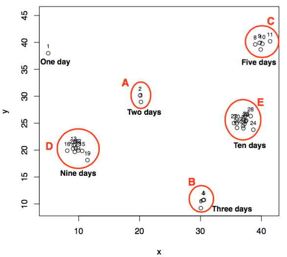
Illustration of k value effect on outlier score
Continuing with the previous post, here, I will illustrate how outlier scores vary while considering different k values. The context of below figure is already explained in my previous post.
After running the LOF algorithm with following R code lines
[code lang="css"]
library(Rlof) # for applying local outlier factor
library(HighDimOut) # for normalization of lof scores
set.seed(200)
df <- data.frame(x = c( 5, rnorm(2,20,1), rnorm(3,30,1), rnorm(5,40,1), rnorm(9,10,1), rnorm(10,37,1)))
df$y <- c(38, rnorm(2,30,1), rnorm(3,10,1), rnorm(5,40,1), rnorm(9,20,1), rnorm(10,25,1))
#pdf("understandK.pdf", width = 6, height = 6)
plot(df$x, df$y, type = "p", ylim = c(min(df$y), max(df$y) + 5), xlab = "x", ylab = "y")
text(df$x, df$y, pos = 3, labels = 1:nrow(df), cex = 0.7)
dev.off()
lofResults <- lof(df, c(2:10), cores = 2)
apply(lofResults, 2, function(x) Func.trans(x,method = "FBOD"))
[/code]
We get the outlier scores for 30 days on a range of k = [2:10] as follows:
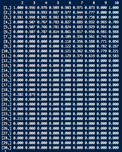
Before explaining results further, I present the distance matrix as below, where each entry shows the distance between days X and Y. Here, X represents row entry and Y represents column entry.
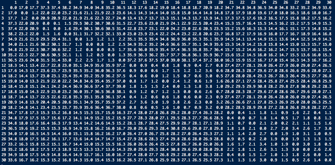
Let us understand how outlier scores get assigned to day 1 on different k's in the range of 2:10. The neighbours of point 1 in terms of increasing distance are:
![]()
Here the first row represents neighbour and the second row represents the distance between point 1 and the corresponding point. While noticing the outlier values of point 1, we find till k = 8, outlier score of point 1 are very high (near to 1). The reason for this is that the density of k neighbours of point 1 till k = 8 is high as compared to point 1. This results in higher outlier score to point 1. But, when we set k = 9, outlier score of point 1 drops to 0. Let us dig it deep further. The 8th and 9th neighbours of point 1 are points 18 and 17 respectively. The neighbours of point 18 in increasing distance are:
![]()
and the neighbours of point 17 are:
![]()
Observe carefully, that 8th neighbour of point 1 is point 18, and the 8th neighbour of point 18 is point 19. While checking the neighbours of point 18 we find that all of its 8 neighbours are nearby (in cluster D). This results in higher density for all k neighbours of point 1 till 8th neighbour as all these points are densest as compared to point 1, and hence point 1 with lesser density gets high anomaly score. On the other hand, 9th neighbour of point 1 is point 17 that has 9th neighbour as point 3. On further checking, we find that for all the points which are in cluster D now find their 9th neighbour either in cluster A or cluster B. This essentially decreases the density of all the considered neighbours of point 1. As a result, now all the points including point 1 and its 9 neighbours have densities in the similar range and hence point 1 gets low outlier score.
I believe that this small example explains how outlier scores vary with different k's. Interested readers can use the provided R code to understand this example further.